NEWS

My work featured in American Art Collector Magazine

Megan Van Groll's work featured in American Art Collector magazine.jpg

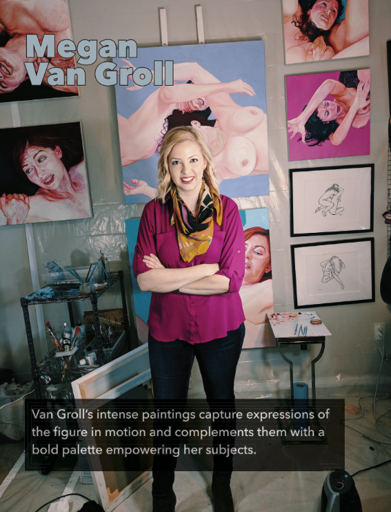
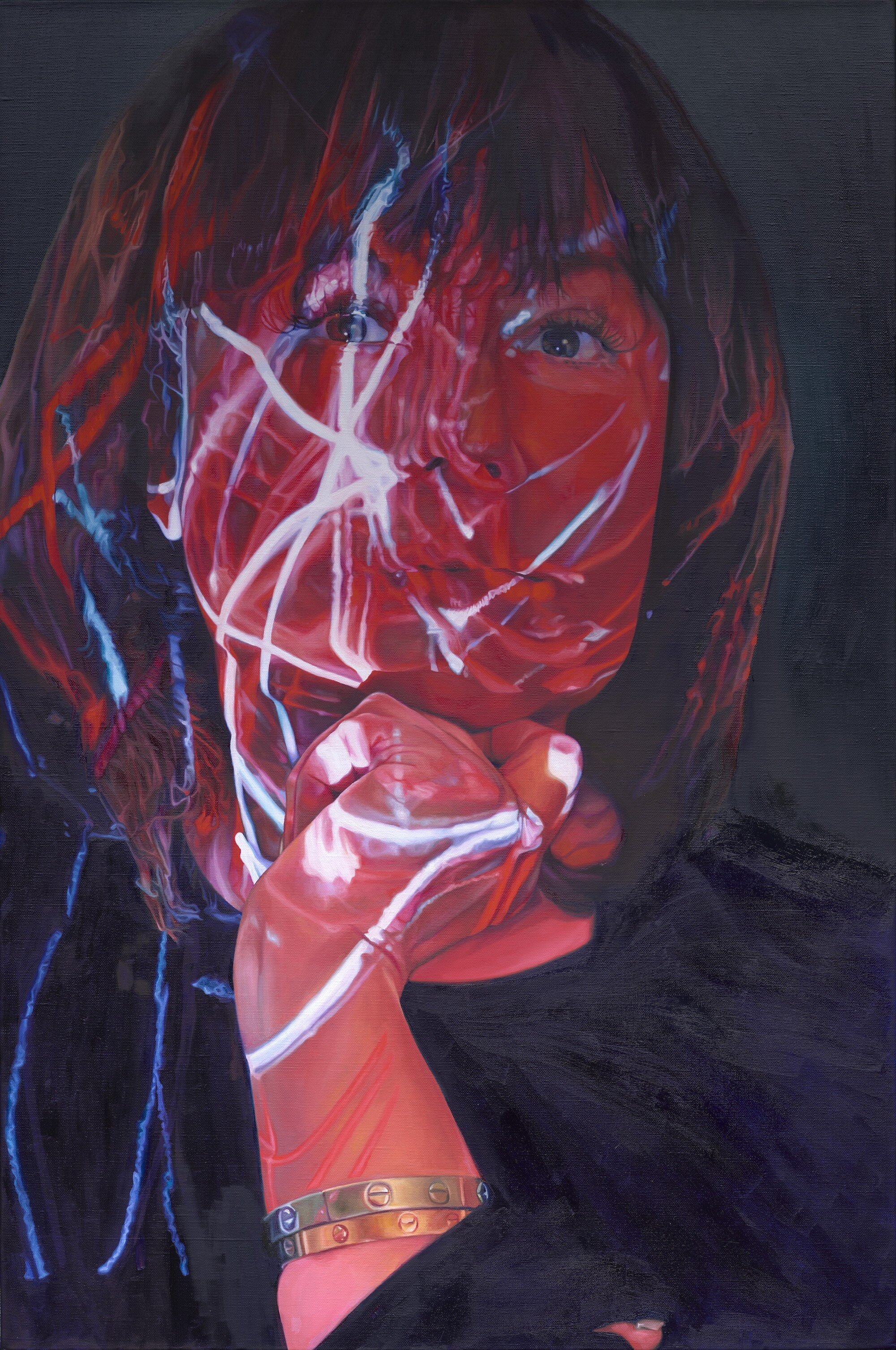
My recent painting of Ana Montoya, titled “The Firestarter,” was recently featured in American Art Collector magazine, a national publication.

The portrait was created for a Chicago exhibition titled “Creator & The Muse,” featuring portraits of artists, collectors, gallerists and other art world elites from the genre of figurative painting.

The exhibition, scheduled to open May 15 at 33 Contemporary Gallery, was canceled due to COVID-19.

The painting’s subject, Ana Montoya, is an artist and the owner of AnArte Gallery in San Antonio.

“The Fire Starter (Portrait of Ana Montoya).” 24”x36,” oil on linen, 2020.

“The Fire Starter (Portrait of Ana Montoya).” 24”x36,” oil on linen, 2020.


With a free account, the digital article is available to view on American Art Collector’s website.

"My Eyes Are Up Here" named Critic's Choice for top 5 art exhibits of the last 12 months by Fort Worth Weekly

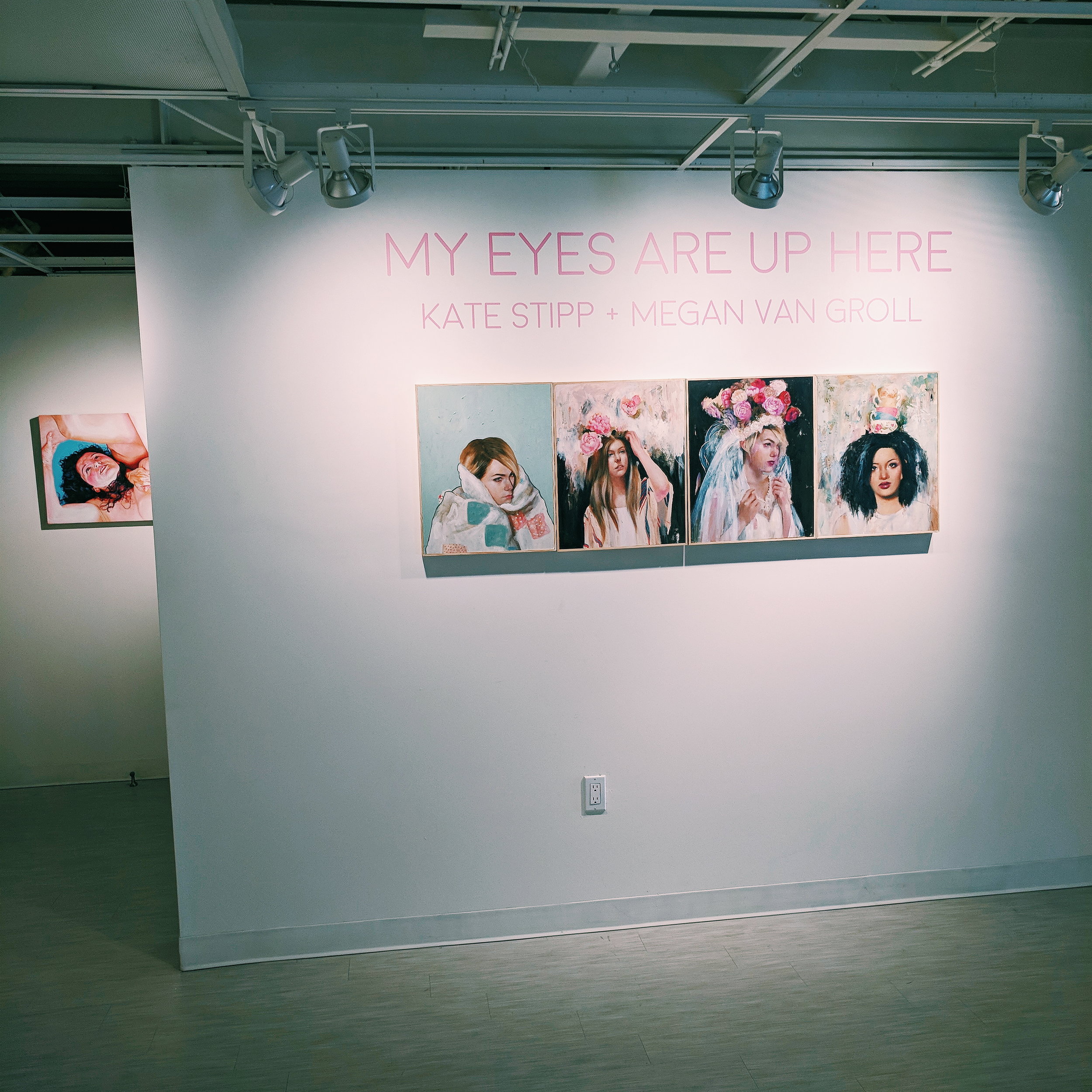
My recent 2-person exhibit at Fort Works Art, “Kate Stipp & Megan Van Groll: My Eyes Are Up Here,” was recently published in Fort Worth Weekly’s annual “best of” selections for the past year as a critic’s choice for one of the top 5 art exhibits in Fort Worth of the past year.

“At Fort Works Art, Kate Stipp and Megan Van Groll tackled the female experience in My Eyes Are Up Here, a symphony of powerful figurative painting that was often as traditionally beautiful as slightly discomfiting.”

Read the full write-up at Fort Worth Weekly.

“Rebirth,” detail. 20”x20,” oil on linen, 2018.

“Rebirth,” detail. 20”x20,” oil on linen, 2018.

Opening of "My Eyes Are Up Here" at Fort Works Art

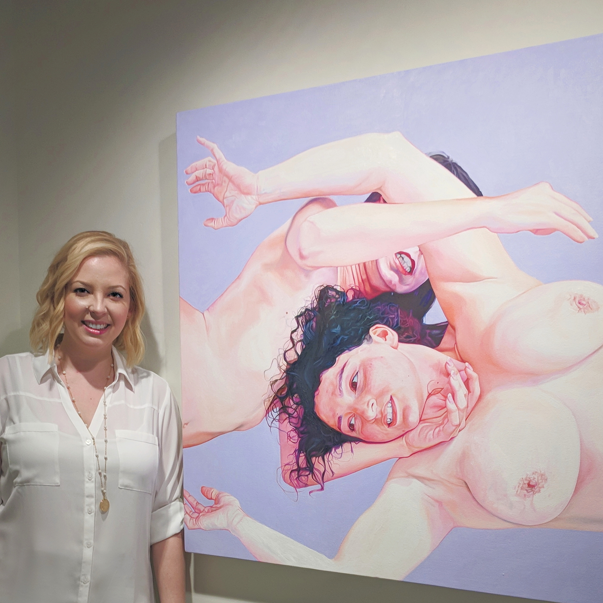
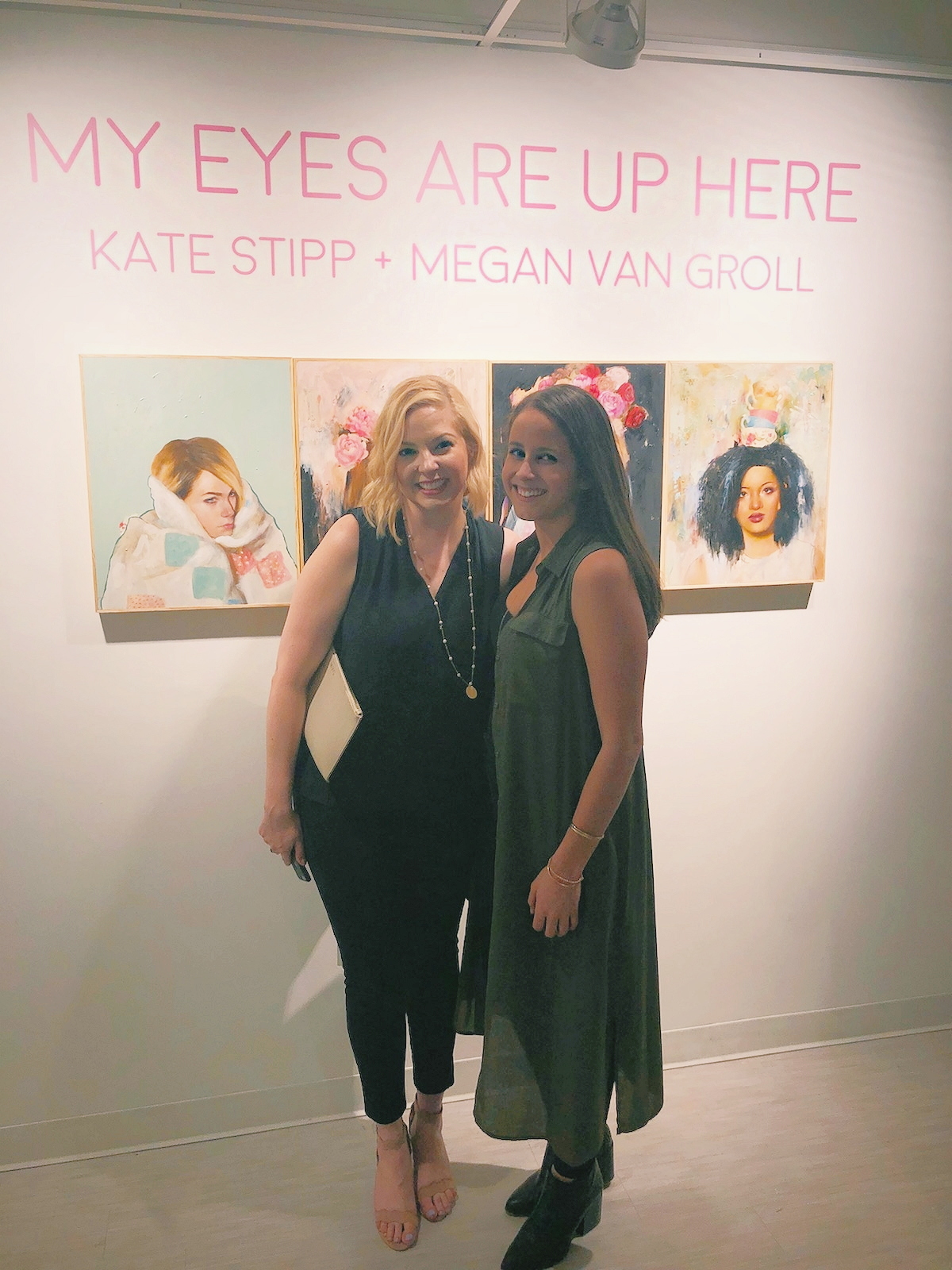
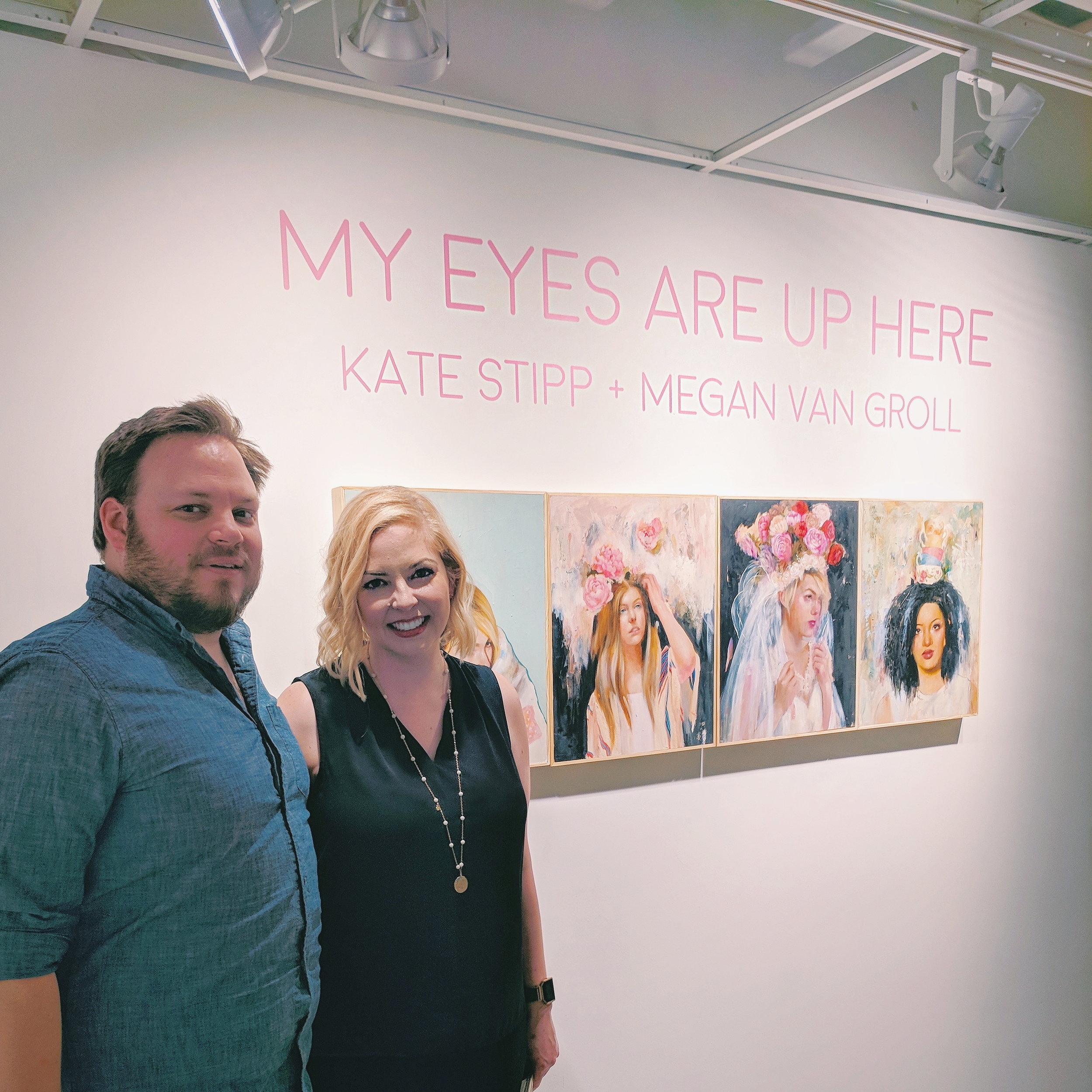
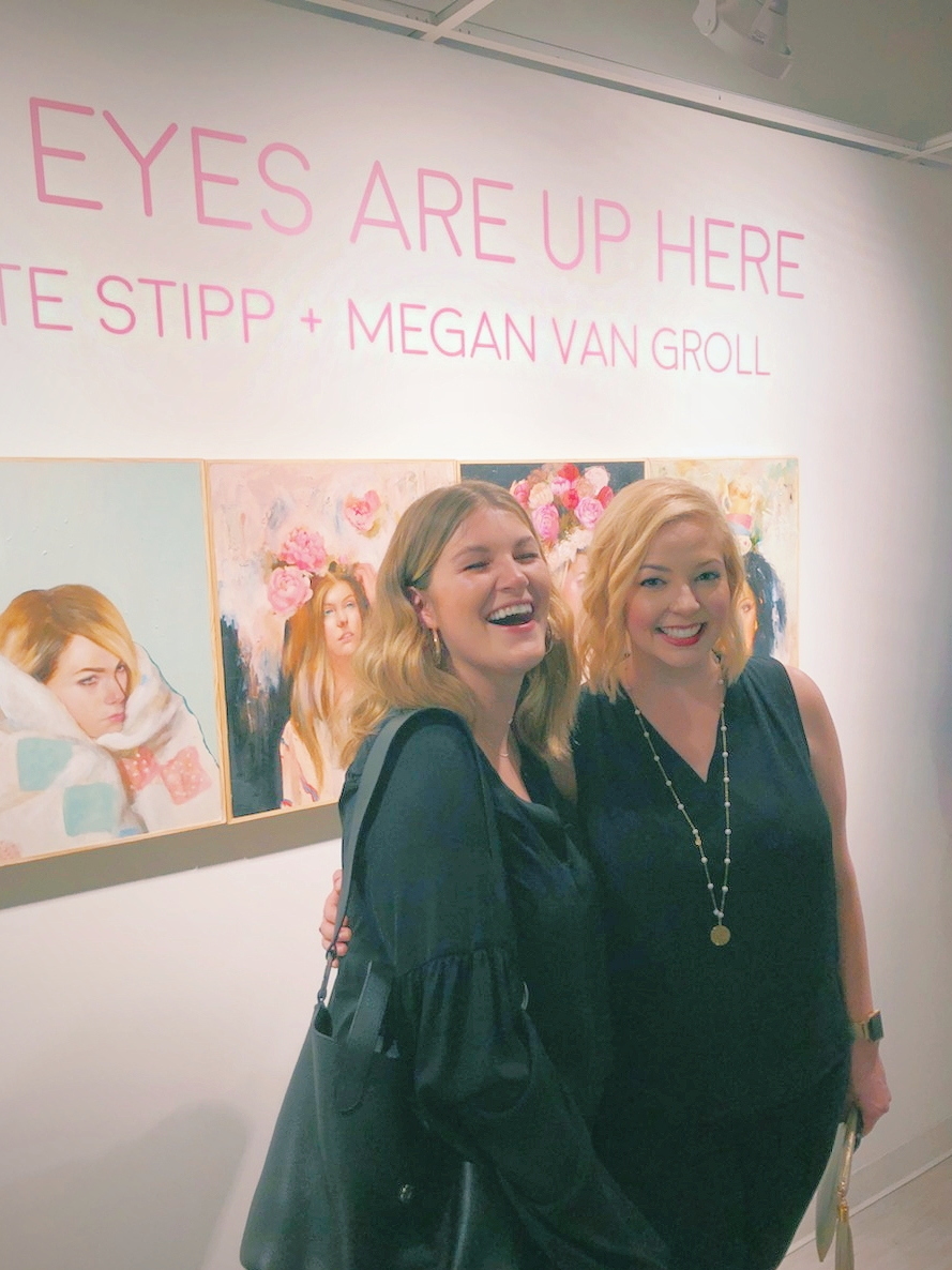
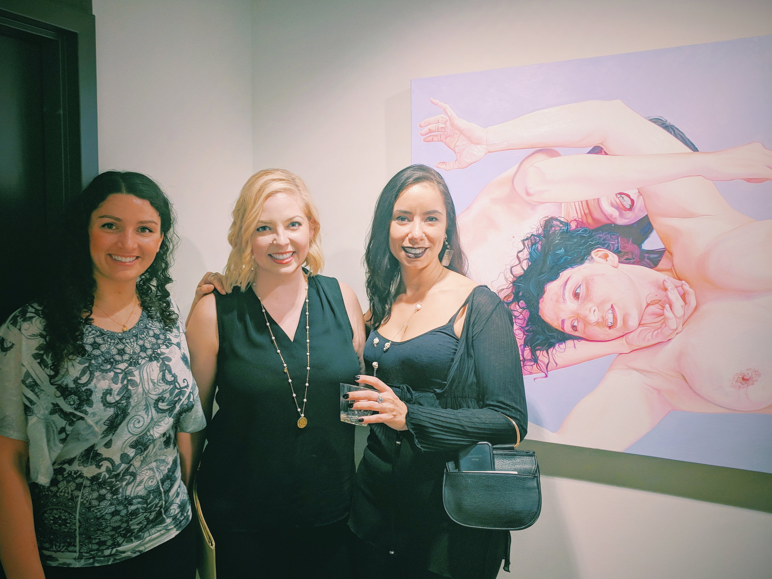
Pictured: Kate Stipp, Megan Van Groll, Lauren Childs, Sarah Colby. 📷: Bill Stipp

Kate Stipp & Megan Van Groll. 📷: Bill Stipp

Kate Stipp & Megan Van Groll. 📷: Bill Stipp

Earlier this year, I was invited by Fort Works Art, a gallery in nearby Fort Worth, Texas, to participate in a 2-person show with fellow figurative painter Kate Stipp.  

I had 7 pieces ready to go at the time I got the call, and created 5 brand new ones for the show in the 9 intense weeks between the invitation and drop-off of the work. I'm thrilled with the way they all came out, and how well-paired they were with Kate's work. 

The opening was during Spring Gallery Night, one of the two most high-traffic evenings in the Fort Worth gallery scene. And the turnout lived up to the hype - it was packed!

"My Eyes Are Up Here" runs through May 5. For details on visiting, or to inquire about any of the work in the show, head over to fortworksart.com.

New painting: "Spiral," oil on linen, 20"x20"

One of my newest paintings, "Spiral," represents two shifts in my work that will impact my future paintings for some time.

First, I chose a bright, hot pinkish-purple for the background color. In this series, the focus is on the figure, not the space around her. In previous paintings, when faced with negative space I didn't want to include, I went with black (or close to black) - such as in "Crush." But my heart craves color, and so here we are.

I have a two-person show coming up soon at Fort Works Art gallery in Fort Worth, Texas. I'm showing 12 paintings and drawings, 5 of which are brand new. Each one of them has a solid color background. Mostly pastel greens, turquoises, lilacs and softer pinks. "Spiral" was the genesis of that direction and I plan to continue pursuing that in some way going forward.

The next shift that this painting represents is my deviation from canvas. Most painters start out using stretched canvas, and most of my work is still made on the sturdy, reliable material. But I craved something different, and had heard so many good things about painting on linen. So I gave it a try with "Spiral." There's just something about the smooth, organic grain of the surface that made painting on it absolutely delightful. Other painters who have switched from canvas to linen know what I mean. It is a bit more expensive than canvas, but it's worth it. You'll see more and more of my work made on linen in the future.

Here are a few high-resolution images of "Spiral," oil on linen, 2017.

Spiral_MeganVanGroll.jpg
Spiral Megan Van Groll oil on linen.jpeg
Spiral Megan Van Groll oil on linen

New painting: "Crush," oil on canvas, 24"x24"

I just received the high-resolution images of one of my recent paintings from my photographer and couldn't be more thrilled to share them. It's not often that you see a photograph of a painting and feel that the camera did the art justice - but in these images, I see every detail and color captured correctly.

That might be because my photographer has access to a shiny new 100 megapixel camera that spits out images that are a whopping 400MB in raw form. Behold:

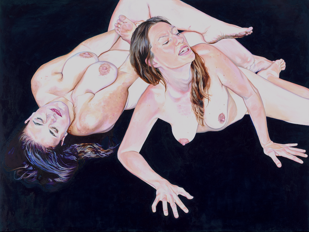
"Crush," 24"x24" oil on canvas, 2017, Megan Van Groll.

"Crush," 24"x24" oil on canvas, 2017, Megan Van Groll.

This painting is the latest of my new series of paintings and drawings that use the nude figure to explore our capacity for a vast range of emotional and psychological experiences. Expressions of fury and rage become the raw contemplation of our deepest fears; erotic desire or pleasure; sharp, crushing grief or despair.

To read the story of how this series came about, click here.

More detail shots:

"Crush (detail)," 24"x24" oil on canvas, 2017, Megan Van Groll.

"Crush (detail)," 24"x24" oil on canvas, 2017, Megan Van Groll.

"Crush (detail)," 24"x24" oil on canvas, 2017, Megan Van Groll.

"Crush (detail)," 24"x24" oil on canvas, 2017, Megan Van Groll.

"Crush (detail)," 24"x24" oil on canvas, 2017, Megan Van Groll.

"Crush (detail)," 24"x24" oil on canvas, 2017, Megan Van Groll.

"Crush (detail)," 24"x24" oil on canvas, 2017, Megan Van Groll.

"Crush (detail)," 24"x24" oil on canvas, 2017, Megan Van Groll.

"Crush (detail)," 24"x24" oil on canvas, 2017, Megan Van Groll.

"Crush (detail)," 24"x24" oil on canvas, 2017, Megan Van Groll.

Want to be the first to find out about new available paintings like this one? Drop me a line here or sign up for emails.

My first museum show: Accepted into WMOCA exhibition juried by Alyssa Monks

I'm very pleased to share some exciting news: my work has been accepted into the 2017 National Juried Art Exhibition at the Wausau Museum of Contemporary Art. The exhibition was juried by an artist I have long admired, Alyssa Monks. 

From the exhibition materials:
Alyssa Monks, a Master of Contemporary Realism, is the Juror of this show. Alyssa sits on the Board of Trustees for the New York Academy of Art and was just recognized as one of the top 30 most influential female artists of our lifetime. Her works are exhibited and collected internationally.

Fun fact: Alyssa Monks and I both attended the drawing and painting program at Istituto Lorenzo de Medici in Florence, Italy, though at different times. Her work is breathtaking and worth a look if you're not familiar. I'm honored to be part of this exhibition - my first in a museum - and to have been selected by a painter I've looked up to for so long.

Here's a zoomed-in detail shot of my new 11"x14" drawing that was selected for exhibition:

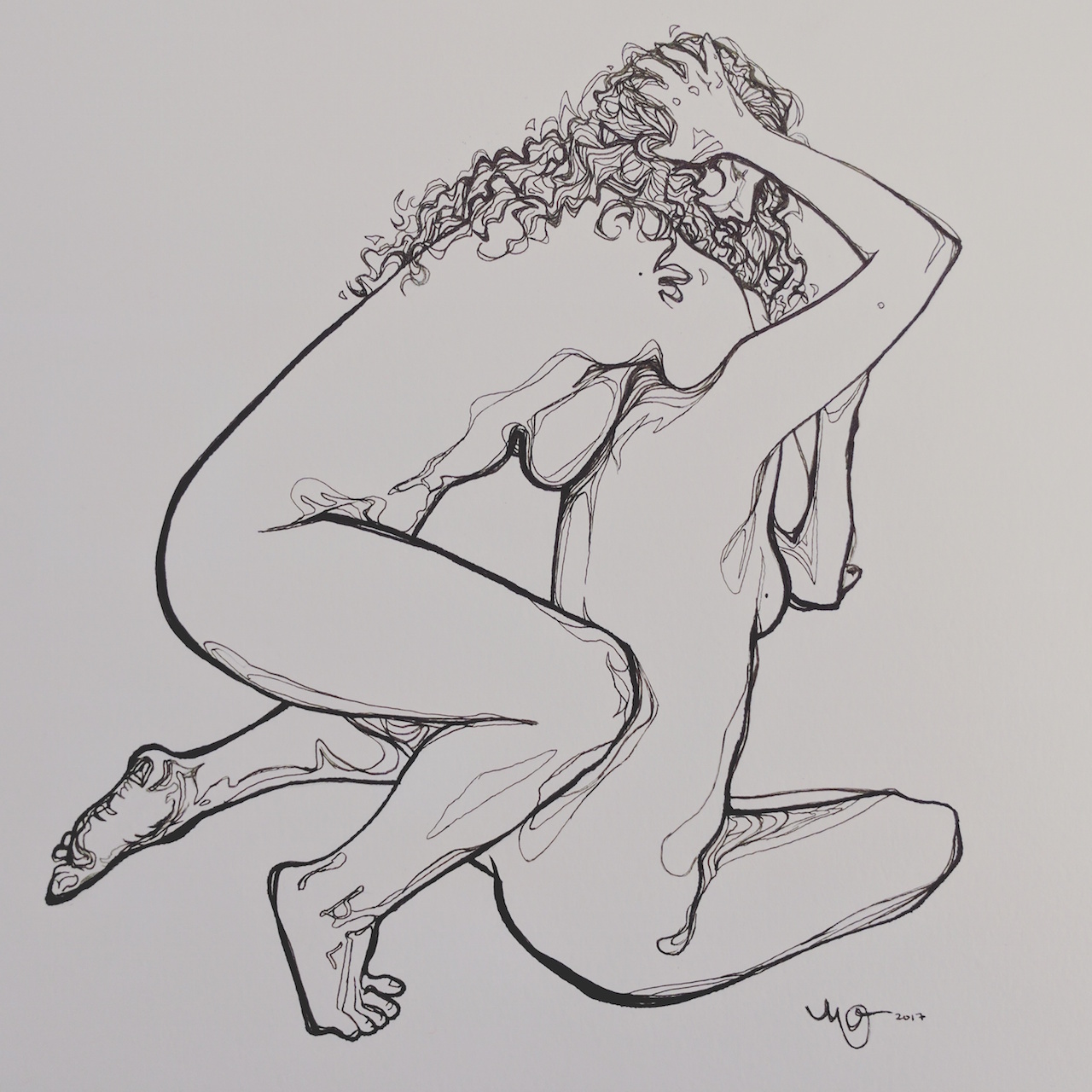
"What Came Before." Graphite on paper, 11"x14", 2017.

"What Came Before." Graphite on paper, 11"x14", 2017.

The opening is October 7 and the exhibition will be on view until December 29. For more information, visit wmoca.org.

This drawing is part of my ongoing series using the female form in various poses of struggle and combat to express and give shape to our emotional and psychological inner lives. Read more about that series in my recent blog post, "My paintings of fighting women: the origin story." And to see the full drawing, click here

New drawing: "What Came Before," 11x14, graphite on paper, 2017.

"What Came Before." 11" x 14," graphite on paper, 2017.

"What Came Before." 11" x 14," graphite on paper, 2017.

Every now and then I like to take a break from my usual medium - oil on canvas or panel - to get back to my roots. One of the aspects I love most about working with graphite is that it feels inherently nostalgic. As an artistic, introverted kid, you could keep me entertained for hours with just a few sheets of loose leaf computer paper and #2 pencils. Now my materials are a little more sophisticated and professional grade. I still have that #2 (which actually means 2B) pencil - but it's supplemented by its HB, 4B, 6B, and 8B counterparts. 

2017-07-13 10.55.45 2.jpg

I am calling this one "What Came Before." It is part of my ongoing series using the female form in various poses of struggle and combat to express and give shape to our emotional and psychological inner lives. Read more about that series in my recent blog post, "My paintings of fighting women: the origin story."

My tiny oil paintings on NYC MetroCards for Single Fare 4

I'm very excited to share my 3 tiny submissions to Single Fare 4, a big show of small works on used NYC MetroCards. This is my second time participating in a Single Fare exhibition. The last show took place back in 2011 and now it's back by popular demand. Artists from around the country (and probably the world) create work with just one limitation - it must be created on the surface of a used NYC MetroCard.

Painting on such a small surface is definitely the challenge it appears to be. Even though my work has been shrinking slightly in the past few years (more typically in the 20"x20" to 24"x24" range than my previous 36"x48" canvases), that's nothing compared to the few inches you get with a MetroCard, which is roughly the size of a credit card. Painting so small forces you to be economical with your decisions - every tiny brush stroke matters in a critical way. 

The show opens September 16 from 5-10pm at Highline Stages (441 West 14th Street, NY, NY) and will be on view again Sunday, September 17 from 12-6pm.

Each card will be for sale for $100 each. The artist takes $70, and $30 go towards new scholarships at the New York Academy of Art and the Alumni Association of the New York Academy of Art. 

For more info, connect with Single Fare on Facebook and Instagram @singlefare.

My paintings of fighting women: the origin story

My latest series of paintings and drawings portray women fighting and grappling with each other in poses inspired by wrestling. For a long time, I have described this series as characterized by anger and the passion of violent, animalistic rage. But that's not entirely true.

These works are about a wide spectrum of emotions and psychological states. They're my humble attempt to render some of the most powerful aspects of the human experience in corporeal form, with the female form serving as a vehicle for this expression.

The postures themselves are only the surface level, and simply set the stage for a broader range of possible interpretations. These vignettes of wrestling - tangled limbs and intertwined body parts - can reveal not just the passion of anger, but the passion of something else, something more ambiguous. To one viewer these scenes may appear less like expressions of fury, and more like the raw contemplation of our deepest fears. To another, more like erotic desire or pleasure than anger. Like sharp, crushing grief or despair. Maybe multiple emotions and internal experiences, all at once. All-consuming love and overwhelming joy, mixed and stirred up with the darkest hour of the soul, inseparably. The uncontainable everything. Perhaps, if I can only paint well enough, transcendence.

During my adolescence and early twenties, I struggled with bouts of depression and its common companion, anxiety. In my first year or two out of art school, I also experienced terrifying panic attacks. Every emotion was intensified. Every negative thought or feeling felt magnified. This, even when my fight-or-flight response wasn't short-circuiting.

During this time, I was living in Austin and found myself attending a concert I didn't really want to be at, in a small, dark and packed venue. Standing in the back, the music and bass pulsing through my body, a wave of powerful dark emotion crashed over me out of nowhere. It began as deep, clawing, claustrophobic despair. But it was more than just a feeling - the experience was inherently physical. Standing still and silent, I had a deeply sad, violent urge to crash my body into the nearest brick wall - like something inside was trying to crawl out of my skin. In that moment, an image flashed into my mind. A sea of flesh and limbs, dozens of figures grappling and intertwining in a vicious struggle. Instantly, I recognized this experience as inspiration, and I saw the image as a painting. Even though I was at no real risk of acting on it, what began as an absurd and destructive impulse became creative.

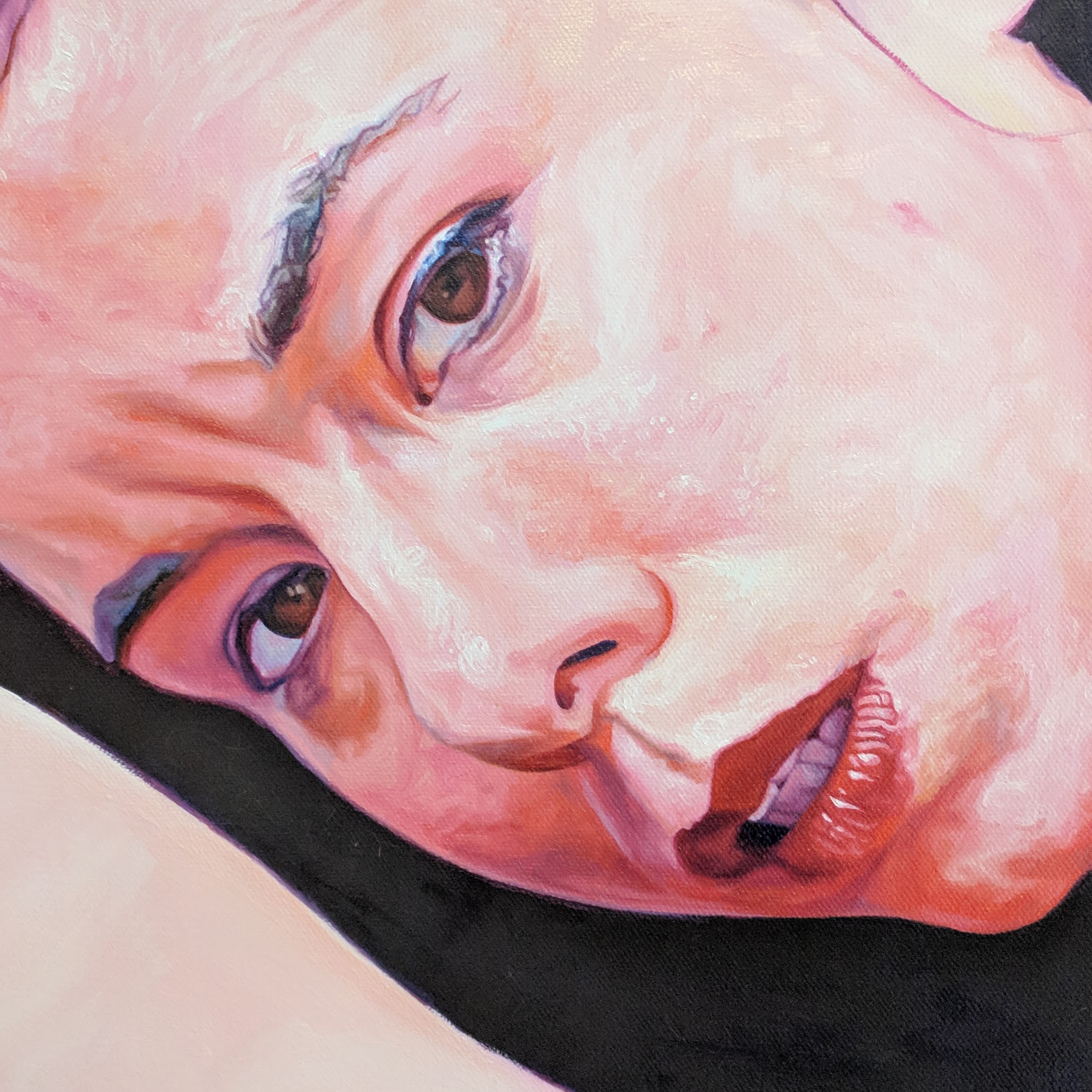
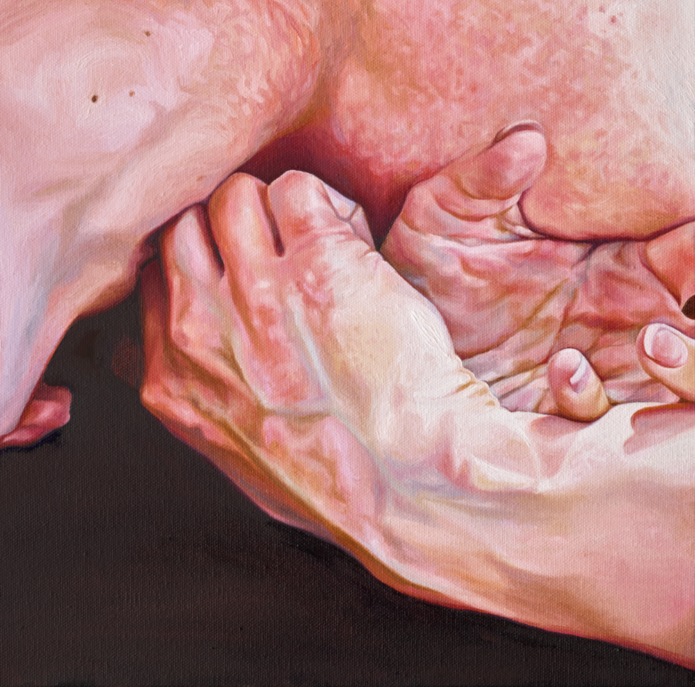
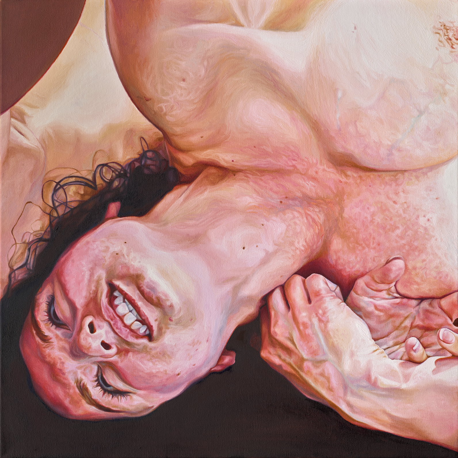
Detail, Flush, 24"x24" oil on canvas, 2017.

Detail, Flush, 24"x24" oil on canvas, 2017.

After this curious experience, I became fascinated with the idea of using the human figure to physicalize these abstract, complex, often contradictory emotional and psychological states. After all, that was what my mind had done - rendered this emotion into an image, taking me out of my dark moment and giving me a project.

Some have asked me why I only paint women. I specifically use the female form in these scenes because I'm personally most interested in how women process and display these complicated, messy human emotions and experiences. And too often in entertainment media (and throughout art history!) women have been treated rather one-dimensionally, with only certain emotions and experiences deemed feminine or acceptable to share with audiences. This normalizes the idea that women and men are more different than we are alike, and ultimately dehumanizes us both.

Therefore, it's important to me that the physical expression of these universally human experiences, and the richness of our inner lives, comes packaged in female form.

As for nudity, there are few images more universal than the human figure presented in its most authentic, natural form. In art, clothing is often a distraction; it immediately conveys a time period, a place, a culture, imparting something specific - something that in this body of work, would not serve my purpose. Stripping away these elements evokes a more visceral response to the work. Though it makes my images a little harder to distribute on social media, the work just wouldn't be the same if my models weren't nude.
On a secondary and perhaps more obvious level, these painting and drawings are also about the relationships women have to each other.

Too often, women view other women as competition - always sizing one another up, and sometimes tearing each other down. I, like probably all women, have been guilty of this too. I want people to look at the altercations in my paintings and wonder, why are they fighting each other? What motivates this? And who stands to benefit from our division?

Although inspiration struck me nearly a decade ago, only in the past two years has this concept really begun to take shape as its own series. Immediately, I made half-steps here and there. In 2010, I painted Bakery Brawl, and in 2011 I made a delightfully confusing small painting of two women wrestling that I didn't intend to show or sell, titled after a lyric from a Neko Case song: "I'm an animal, you're an animal too." Little did I know the path this intended one-off would eventually take me down.

"You're an animal." 18"x24" oil on canvas, 2011.

"You're an animal." 18"x24" oil on canvas, 2011.

But I wasn't quite ready to take it further. In the ensuing years, I focused on honing my love for hyperrealism (inspired by seeing Chuck Close's "Mark" at the Metropolitan Museum of Art) with large, blown up oil portraits. As much as I enjoyed these for the sake of painting them, I knew I was growing bored.

Finally, a familiar, restless urge brought me back to my earlier fascination, and this craving to paint the strange scenes in my head became an entire series.

Some ideas need time to marinate. And two years and several paintings and drawings in, the work is still evolving and being refined. I've only just begun, and I'm grateful to have a rich, deep well of inspiration (and lovely, brave, open-minded models) for the path ahead.

Awarded a Publication Fellowship by Peripheral Vision Arts for Salon 2017

I'm pleased to share some exciting news from art journal Peripheral Vision Arts. I've been awarded a Publication Fellowship for their forthcoming Salon 2017, and will be featured in the publication with a portfolio of my work. 

From their release:

Peripheral Vision is pleased to award Publication Fellowships to forty eight emerging and mid-career professional American artists in conjunction with our inaugural salon-style exhibition, curated by critic Georgia Erger. Submitted works represent the diversity of contemporary art practice and occupy various points of intersection around common themes and aesthetic concerns. Salon 2017, forthcoming this fall, will take the form of an introductory essay by the curator containing links to artist project pages.

I look forward to seeing the all of the work together with Georgia Ergers' commentary when the publication is released this fall.

Thank you to Peripheral Vision Arts for the opportunity to be part of such a great group of artists. To check out the full list of artists, click here.

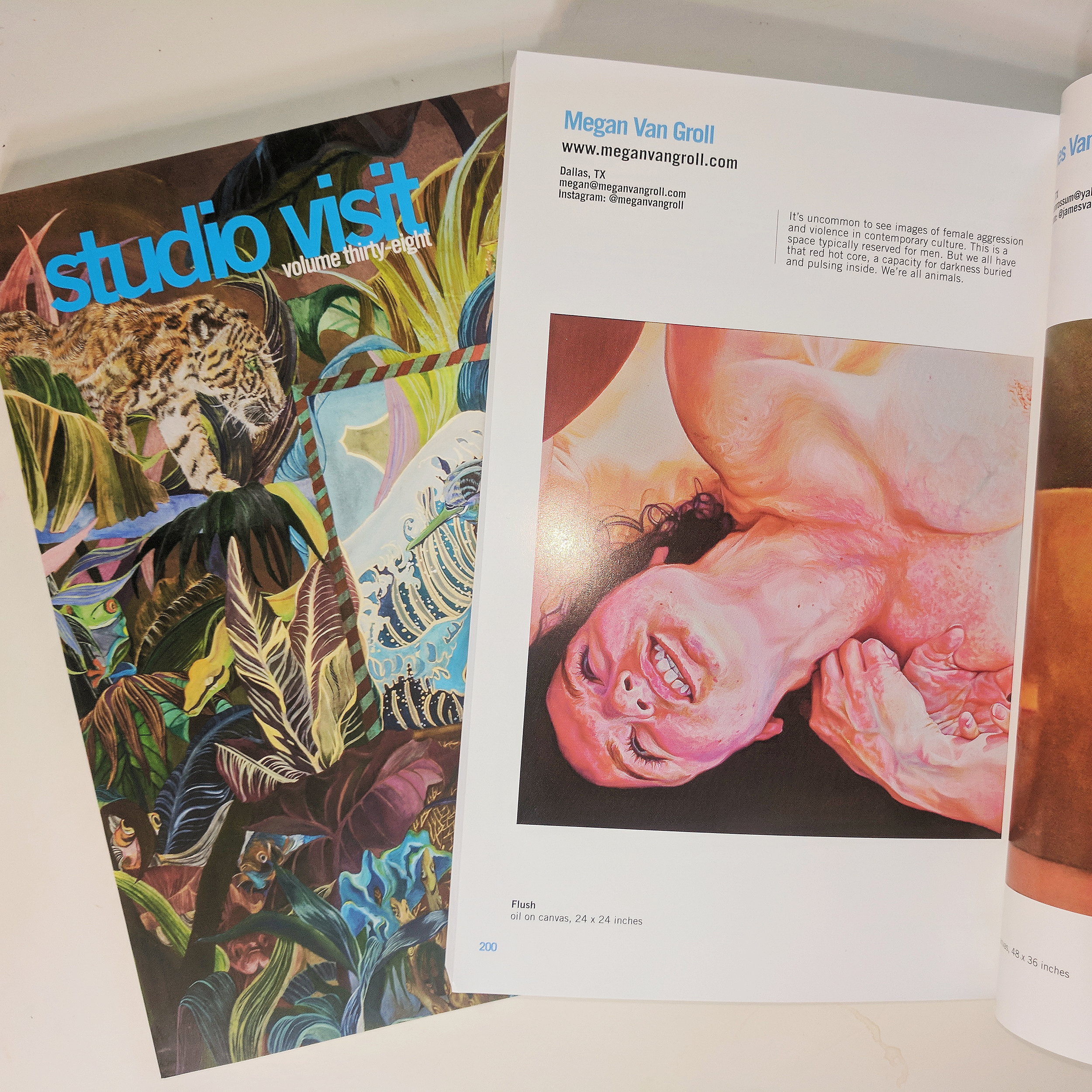
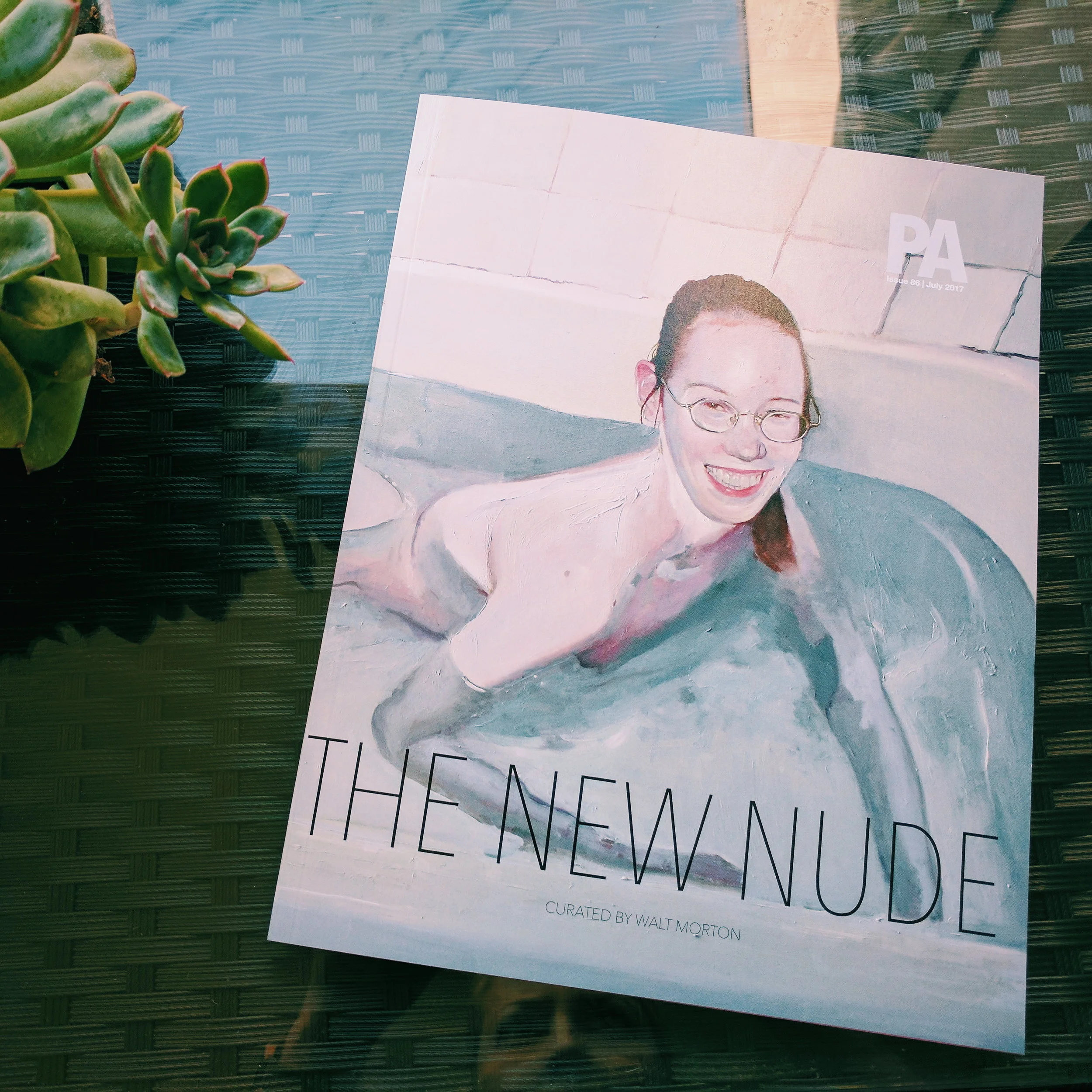
My work published in The New Nude, curated by Walt Morton for PoetsArtists Magazine

thenewnude

Two of my paintings were recently published in The New Nude, an art publication by PoetsArtists magazine, curated by Walt Morton. 

thenewnudemvg

I was so thrilled to receive the book - not just to see my paintings, but because the rest of the work was so fascinating. Flipping through the pages, I felt inspired and motivated. In today's art world, it's considered a little old-fashioned to focus on painting the figure, but the artists in this printed exhibition confirm that figure painting is still as relevant, modern, and fresh as ever.

You can get a printed copy or purchase a PDF version here. You can also access the publication by becoming a supporter of independent arts magazine and community PoetsArtists on Patreon.

Flush, 24 x 24, oil on canvas

I first wrote about this piece a few weeks ago, marveling at how it only took me 3 weeks to paint from beginning to end - a labor so brief that it's pretty much unheard of for me for a painting of this size.

I now have high-res, color-corrected images to share. I love this part - being able to show the detail in almost as much accuracy as viewing the piece in person; the grain of the canvas, the little raised strokes from paint thickly applied.

When I finish a piece I'm either exasperated or energized. When it feels like I'm getting close to hitting a wall (the edge of my interest in a series, the near-final crack at an idea, the conclusion of some kind of creative era) I'll be happy to finish the piece -- it's not unlike the dopamine rush of finishing a race -- but I may feel puzzled as to where to go next. The end of this piece felt more like a beginning. Zoomed closer in, it's almost a happy medium between my recent dual, dueling figures and my 2012-2014 hyperrealistic portraits, in which I brought the viewer so close to the skin that it rendered almost abstractly, like a landscape of pockmarked desert. Here, the close crop leaves out context - where that limb goes next, who's with her - and imbues the mystery I seek. The proximity also gives way to a hyper level of detail and brushwork, scratching my eternal itch to render skin and features in a lifelike yet playful, painterly way. I don't have any other medium or large pieces in the works at the moment begging for attention (just two very small studies), so I am free to start fresh and follow this path where it leads me, and it feels good.

This series explores aggression in both broad and specific interpretations of the term. Flush felt appropriate to me as a title, not just because of the magenta flush of blood to the subject's face, but for its other meanings. It can also refer to a kind of emotional catharsis, or a cleansing. In her face, I can see that interpretation. But the term flush is also sometimes used in reference to hunting, to predators driving prey from their cover. In that context, the strained, twisted grapple of our subject and her opponent becomes dark again.

Flush, 24" x 24," oil on canvas. © Megan Van Groll, 2017.

Flush, 24" x 24," oil on canvas. © Megan Van Groll, 2017.

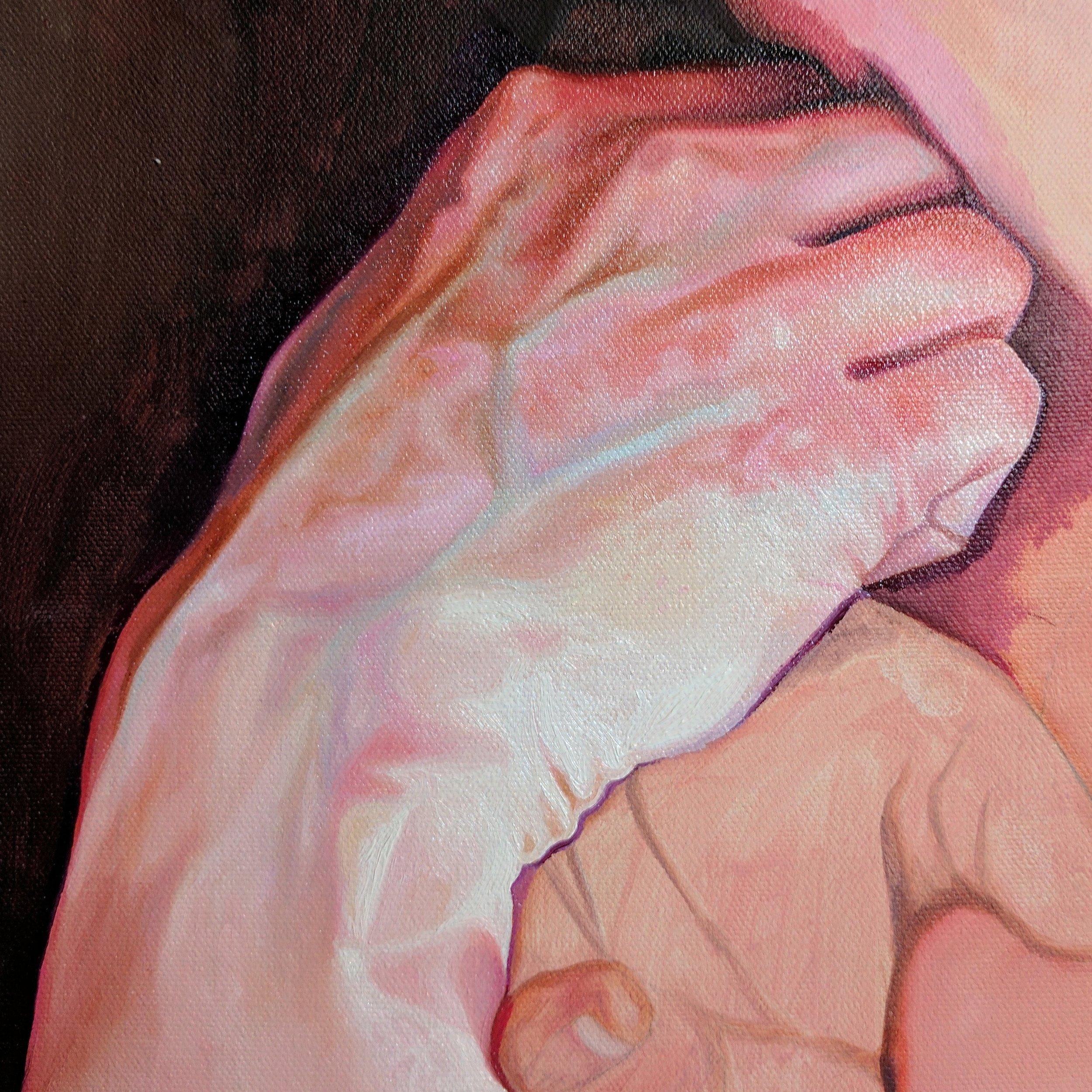
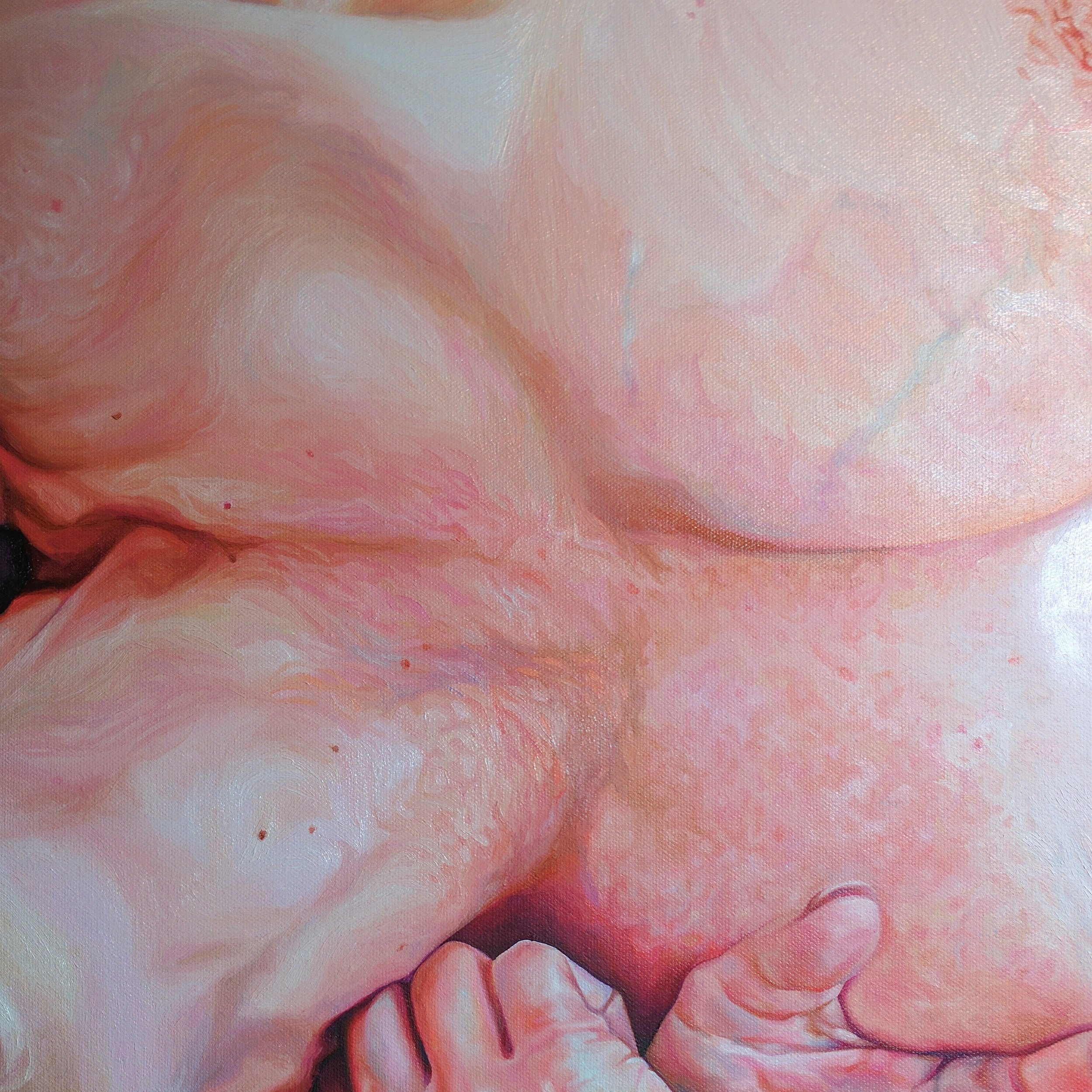
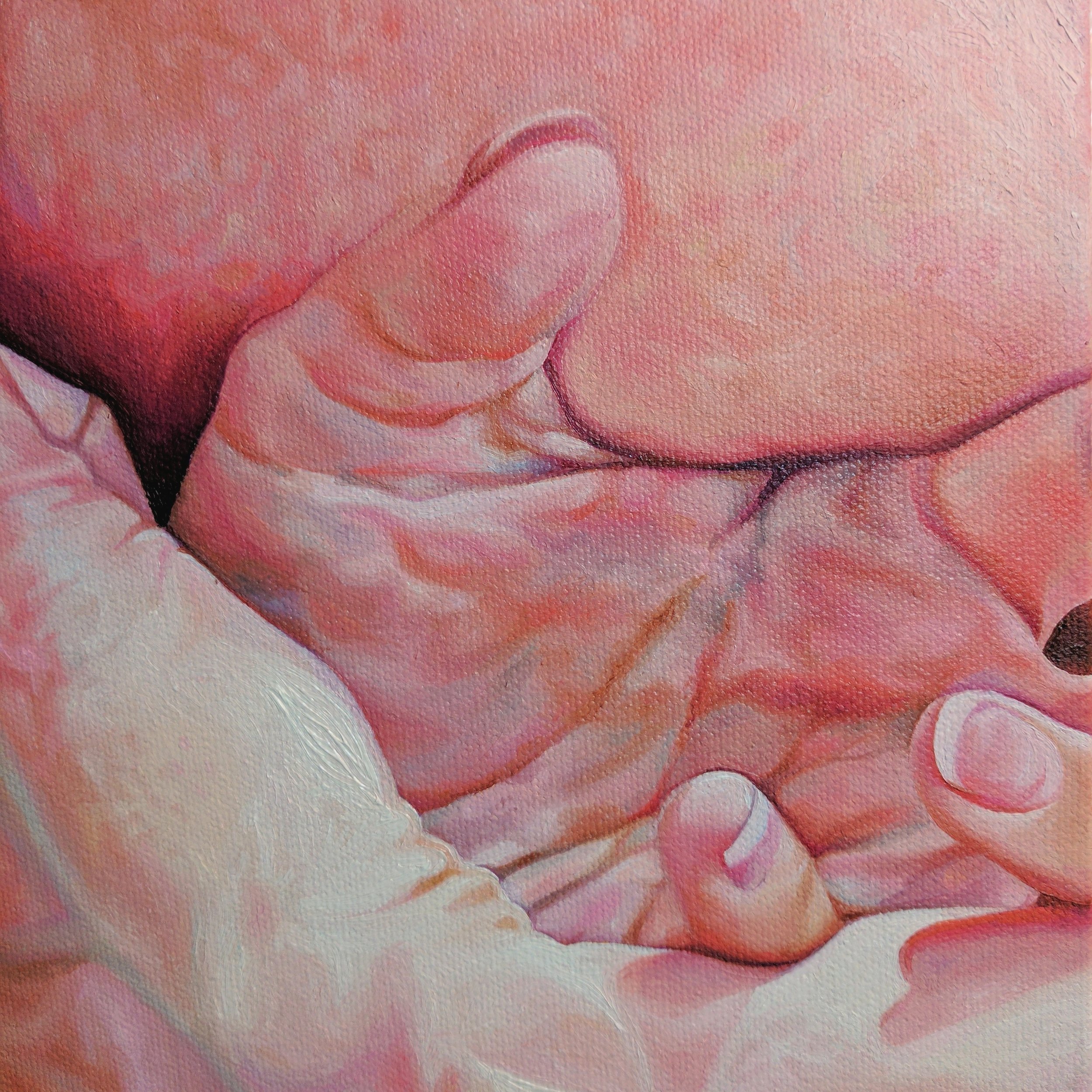
Flush, detail, 24" x 24," oil on canvas. © Megan Van Groll, 2017.

Flush, detail, 24" x 24," oil on canvas. © Megan Van Groll, 2017.

Flush, detail, 24" x 24," oil on canvas. © Megan Van Groll, 2017.

Flush, detail, 24" x 24," oil on canvas. © Megan Van Groll, 2017.

3 weeks: a whirlwind, a tangle of limbs

I am a notoriously slow painter. I have been known to take, at times, several months to complete a painting. In my defense, I often work on other smaller pieces when my inspiration and motivation for a complex, large work dries up -- so I'm rarely entirely unproductive, just switching back and forth. Still, it's unheard of for me to take a single piece from conception to completion in as short a time frame as, say, 3 weeks. 

But that's what happened with this piece. I sketched the piece onto canvas and laid an underpainting onto the surface in the third week of January, and completed it the second week of February. 

So what happened? Why the rush, why the sudden outburst?

First of all, I'll state the obvious: this painting is smaller than many of my larger pieces, which are usually 36"x48" at their largest. But at 24"x24," it's not diminutive either. I think it's more notable that I skipped my usual multiple thin washes of color, which must dry before I can begin to lay down thicker paint and the skin tones (and anything resembling the hue and tone that will eventually be prominent). No -- instead I went straight for it, in a more alla prima fashion, laying down colors that are at least close to what will eventually make up the final painting. The wash of solid color underneath is thought to lend critical depth, so I worried that skipping this step would result in flat, unrealistic, boring color.

I didn't need to worry.

It turns out I can't help but lay down swirling layer upon layer of color, both lowlights and highlights. The most passionate love affair of my creative life belongs to colors dialed to 11; crazy bright, bursting, buzzing electric colors so saturated they practically sweat excess pigment. Despite this, my eye still seeks out respites of cool, earthy, tones -- phthalo turquoise ropes of veins encircling a wrist; diluted violet and ultramarine eye sockets -- as these just serve to bring out pops of warmth even more. 

It turns out, it actually helps me to not swing my colors in any one direction in the beginning. When I ground a painting in a single color at first, I too often strive for the rest of the piece to create equilibrium, a calm realism, something that feels 'normal.' And I have to say, the result can still be interesting, but it's not nearly as unique to my specific artistic style. It doesn't feel as 'me,' whatever that means.

These images were shot with my phone, so they can only go so far to show you the real quality of the piece. Therefore, I'm only sharing detail shots here. I'll share another update -- showing the piece in full -- when it's professionally scanned into a print-quality high resolution image next week.

Until then!