NEWS

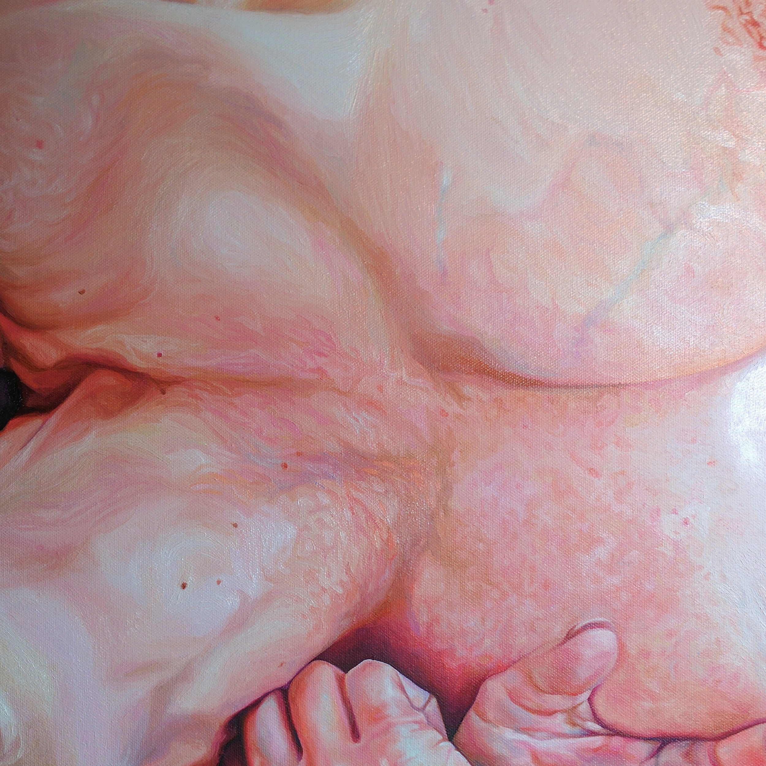
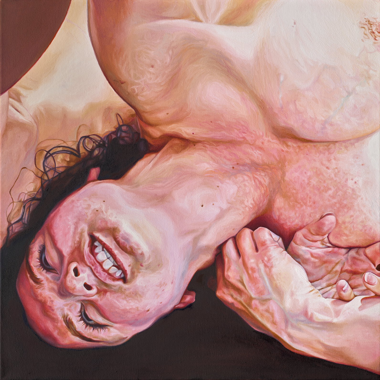
Flush, 24 x 24, oil on canvas

I first wrote about this piece a few weeks ago, marveling at how it only took me 3 weeks to paint from beginning to end - a labor so brief that it's pretty much unheard of for me for a painting of this size.

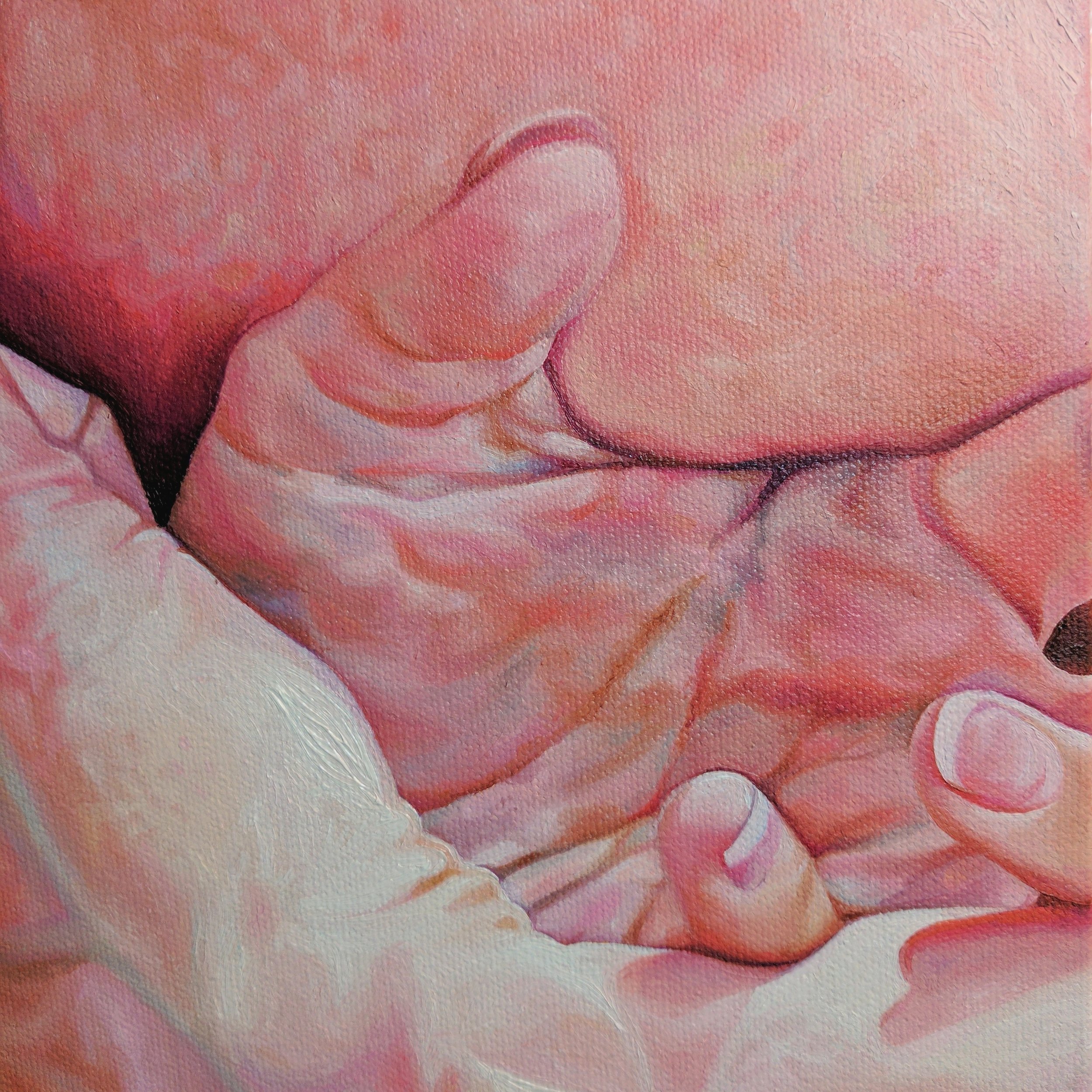
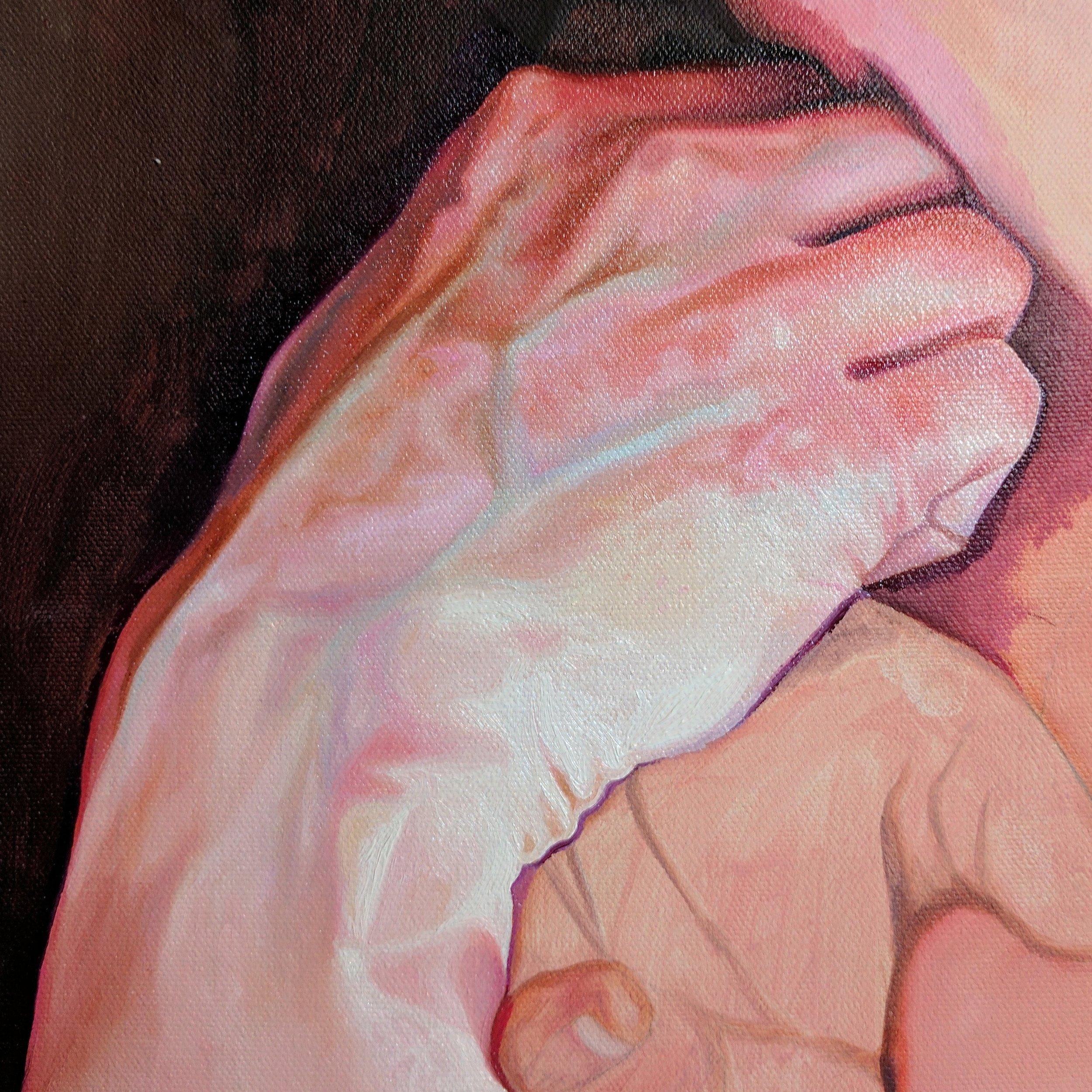
I now have high-res, color-corrected images to share. I love this part - being able to show the detail in almost as much accuracy as viewing the piece in person; the grain of the canvas, the little raised strokes from paint thickly applied.

When I finish a piece I'm either exasperated or energized. When it feels like I'm getting close to hitting a wall (the edge of my interest in a series, the near-final crack at an idea, the conclusion of some kind of creative era) I'll be happy to finish the piece -- it's not unlike the dopamine rush of finishing a race -- but I may feel puzzled as to where to go next. The end of this piece felt more like a beginning. Zoomed closer in, it's almost a happy medium between my recent dual, dueling figures and my 2012-2014 hyperrealistic portraits, in which I brought the viewer so close to the skin that it rendered almost abstractly, like a landscape of pockmarked desert. Here, the close crop leaves out context - where that limb goes next, who's with her - and imbues the mystery I seek. The proximity also gives way to a hyper level of detail and brushwork, scratching my eternal itch to render skin and features in a lifelike yet playful, painterly way. I don't have any other medium or large pieces in the works at the moment begging for attention (just two very small studies), so I am free to start fresh and follow this path where it leads me, and it feels good.

This series explores aggression in both broad and specific interpretations of the term. Flush felt appropriate to me as a title, not just because of the magenta flush of blood to the subject's face, but for its other meanings. It can also refer to a kind of emotional catharsis, or a cleansing. In her face, I can see that interpretation. But the term flush is also sometimes used in reference to hunting, to predators driving prey from their cover. In that context, the strained, twisted grapple of our subject and her opponent becomes dark again.

Flush, 24" x 24," oil on canvas. © Megan Van Groll, 2017.

Flush, 24" x 24," oil on canvas. © Megan Van Groll, 2017.

Flush, detail, 24" x 24," oil on canvas. © Megan Van Groll, 2017.
Flush, detail, 24" x 24," oil on canvas. © Megan Van Groll, 2017.

Flush, detail, 24" x 24," oil on canvas. © Megan Van Groll, 2017.

Flush, detail, 24" x 24," oil on canvas. © Megan Van Groll, 2017.
3 weeks: a whirlwind, a tangle of limbs

I am a notoriously slow painter. I have been known to take, at times, several months to complete a painting. In my defense, I often work on other smaller pieces when my inspiration and motivation for a complex, large work dries up -- so I'm rarely entirely unproductive, just switching back and forth. Still, it's unheard of for me to take a single piece from conception to completion in as short a time frame as, say, 3 weeks. 

But that's what happened with this piece. I sketched the piece onto canvas and laid an underpainting onto the surface in the third week of January, and completed it the second week of February. 

So what happened? Why the rush, why the sudden outburst?

First of all, I'll state the obvious: this painting is smaller than many of my larger pieces, which are usually 36"x48" at their largest. But at 24"x24," it's not diminutive either. I think it's more notable that I skipped my usual multiple thin washes of color, which must dry before I can begin to lay down thicker paint and the skin tones (and anything resembling the hue and tone that will eventually be prominent). No -- instead I went straight for it, in a more alla prima fashion, laying down colors that are at least close to what will eventually make up the final painting. The wash of solid color underneath is thought to lend critical depth, so I worried that skipping this step would result in flat, unrealistic, boring color.

I didn't need to worry.

It turns out I can't help but lay down swirling layer upon layer of color, both lowlights and highlights. The most passionate love affair of my creative life belongs to colors dialed to 11; crazy bright, bursting, buzzing electric colors so saturated they practically sweat excess pigment. Despite this, my eye still seeks out respites of cool, earthy, tones -- phthalo turquoise ropes of veins encircling a wrist; diluted violet and ultramarine eye sockets -- as these just serve to bring out pops of warmth even more. 

It turns out, it actually helps me to not swing my colors in any one direction in the beginning. When I ground a painting in a single color at first, I too often strive for the rest of the piece to create equilibrium, a calm realism, something that feels 'normal.' And I have to say, the result can still be interesting, but it's not nearly as unique to my specific artistic style. It doesn't feel as 'me,' whatever that means.

These images were shot with my phone, so they can only go so far to show you the real quality of the piece. Therefore, I'm only sharing detail shots here. I'll share another update -- showing the piece in full -- when it's professionally scanned into a print-quality high resolution image next week.

Until then!